Why Fonts Matter More Than Couples Realize
A wedding invitation is often the first real glimpse guests get of the celebration. Before they see the venue, the flowers, the dress, or the table settings, they see the invitation. And while color, paper, and layout all matter, the font quietly does much of the emotional work.
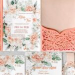
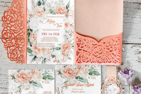
Fonts create mood before a guest reads a single full sentence. A delicate script can feel romantic. A crisp serif can feel formal and timeless. A clean modern font can suggest a stylish city wedding. A loose handwritten typeface might hint at a relaxed garden ceremony or beach celebration. That is why exploring wedding invitation font ideas is more than a design detail. It is part of shaping the story of the day.
The right font does not need to be dramatic. Sometimes the most elegant invitation uses one simple typeface beautifully. Other times, a thoughtful pairing of fonts creates contrast and personality. What matters most is that the style feels true to the couple and easy for guests to read.
Classic Serif Fonts for Timeless Invitations
Serif fonts are a natural choice for couples who want their invitations to feel graceful, traditional, and refined. These fonts have small strokes at the ends of letters, which gives them a sense of history and polish. They are often used in books, formal stationery, and editorial design, so they carry a quiet authority.
For a black-tie wedding, a serif font can instantly set the tone. It pairs beautifully with thick card stock, ivory paper, black ink, and traditional wording. A well-spaced serif font can look formal without feeling stiff. It says the occasion is meaningful, but it does not need to overstate itself.
Serif fonts also work for romantic weddings, especially when paired with soft colors or textured paper. A classic serif in warm gray or deep brown can feel gentle and sophisticated. It is a good option for couples who want elegance but not too much ornament.
The key is spacing. Serif fonts can feel heavy if they are crowded together. When given enough breathing room, they become calm and beautiful. On a wedding invitation, that space can make the whole design feel more expensive and thoughtful, even when the layout is quite simple.
Script Fonts for Romance and Softness
Script fonts are what many people imagine when they think of wedding stationery. They have movement, curves, and a handwritten quality that feels personal. Used well, they can bring softness and romance to an invitation. Used too much, they can become difficult to read.
This is where balance matters. A script font is often best for the couple’s names, a short phrase, or a featured line. It does not always work well for every detail on the card. Guests should not have to decode the date, time, or venue address.
A flowing script can suit classic ballroom weddings, floral garden celebrations, and candlelit evening receptions. A looser, more casual script can feel right for beach weddings, backyard ceremonies, or rustic venues. There are also modern calligraphy-style fonts that feel fresh rather than overly traditional.
When choosing a script, couples should look at every letter in their names. Some fonts look beautiful in samples but awkward with certain initials or letter combinations. A name with many loops, tails, or double letters may look too busy in a very decorative script. Testing the actual wording is always better than choosing a font from a sample phrase alone.
Modern Sans-Serif Fonts for Clean Designs
Sans-serif fonts are clean, simple, and often very stylish. They do not have the small finishing strokes seen in serif fonts, which gives them a more modern appearance. These fonts are especially popular for minimalist wedding invitations, city weddings, gallery-style venues, and contemporary celebrations.
A sans-serif font can make an invitation feel fresh and uncluttered. It works beautifully with white space, simple layouts, and neutral color palettes. When the design relies on clean lines rather than decoration, the font choice becomes even more important.
Some sans-serif fonts feel soft and rounded, while others are sharp and architectural. A rounded font might suit a relaxed modern wedding. A narrow, structured font can feel sleek and editorial. Wider letter spacing can add elegance and make even a simple design feel carefully composed.
Sans-serif fonts are also practical because they are usually easy to read. This makes them a strong choice for information cards, RSVP details, wedding websites, and venue directions. For couples who want beauty without fuss, a clean sans-serif font can be the perfect foundation.
Handwritten Fonts for a Personal Touch
Handwritten fonts bring a sense of warmth. They can make an invitation feel less formal and more intimate, almost like a note from the couple. This style works well for smaller weddings, outdoor ceremonies, bohemian celebrations, and weddings with a relaxed, personal mood.
The beauty of handwritten fonts is that they feel human. They do not always follow perfect symmetry, and that can be part of their charm. A slightly uneven line or casual stroke can make the design feel approachable rather than overly polished.
Still, handwritten fonts need care. Some are charming in small amounts but messy in full paragraphs. Others may feel too childish or informal for a wedding invitation. The best handwritten font should look intentional, not like an afterthought.
These fonts often pair nicely with simple serif or sans-serif fonts. The handwritten style can highlight the couple’s names, while the supporting text stays clean and readable. This kind of pairing gives the invitation personality without making it confusing.
Font Pairings That Feel Balanced
Pairing fonts is one of the most useful wedding invitation font ideas because it allows couples to create depth without adding too many design elements. A good pairing creates contrast while still feeling harmonious.
A classic combination is script with serif. The script adds romance, while the serif brings structure. This works especially well for formal or semi-formal weddings. Another popular option is script with sans-serif, which feels more modern and fresh. The script softens the design, while the sans-serif keeps the details clean.
Serif and sans-serif fonts can also work beautifully together. This pairing feels editorial, balanced, and timeless. The serif might be used for names or headings, while the sans-serif handles the smaller details. It is a smart choice for couples who want understated elegance.
The mistake to avoid is using too many fonts at once. Two fonts are usually enough. Three can work in rare cases, but only if the design is handled carefully. Too many typefaces can make the invitation feel scattered, even if each font is beautiful on its own.
Matching Fonts to Wedding Themes
Every wedding has a mood, even if the couple has not put it into words yet. The font should support that mood. For a formal evening wedding, classic serif fonts, elegant scripts, and generous spacing can feel appropriate. For a rustic wedding, a softer serif or relaxed handwritten font may feel more natural.
A beach wedding might use light, airy typography with simple lines and soft spacing. A garden wedding can look lovely with romantic script, delicate serif lettering, or subtle botanical-inspired design. A modern city wedding may call for bold sans-serif fonts, monochrome details, and a clean layout.
For vintage weddings, fonts with old-world character can work beautifully, but restraint is important. A vintage-inspired typeface should feel nostalgic, not theatrical. For luxury weddings, the font does not always need to be ornate. Often, a refined serif on beautiful paper feels more luxurious than a heavily decorated design.
The best font choice gives guests a small preview of the day. It quietly tells them whether to expect something formal, relaxed, romantic, modern, or intimate.
Readability Should Always Come First
A wedding invitation can be beautiful, but it still has a job to do. Guests need to understand the names, date, time, location, dress code, and other important details. If the font is difficult to read, the design loses its purpose.
This matters especially with script and decorative fonts. A highly ornamental font may look lovely in a large heading but become frustrating in smaller text. Thin fonts may disappear when printed in pale colors. Very small lettering can look elegant in a digital mockup but feel hard to read on paper.
Couples should also think about older guests or anyone who may struggle with tiny or overly stylized text. Clear does not mean boring. It simply means considerate.
A good rule is to print a sample before making a final decision. What looks perfect on a screen may feel different in hand. Paper texture, ink color, and font size can all affect readability.
Small Details That Make Fonts Feel Elegant
Font choice is only one part of the design. How the font is used matters just as much. Letter spacing, line spacing, alignment, and hierarchy all influence the final look.
Centered text feels classic and ceremonial. Left-aligned text can feel modern and editorial. Wide spacing between capital letters can add a polished feel, especially for dates, locations, or small headings. Larger names create emphasis, while smaller supporting details keep the layout calm.
Capitalization also changes the mood. All caps can feel formal and structured. Lowercase lettering can feel softer and more contemporary. Title case sits comfortably in the middle.
Even punctuation plays a role. Some minimalist invitations use fewer commas and decorative marks to keep the design clean. Traditional invitations may use more formal punctuation and line breaks. These little choices shape the rhythm of the invitation.
Conclusion: Choosing a Font With Feeling
Wedding invitation fonts are not just about style. They help create the first emotional impression of the wedding day. A font can make an invitation feel romantic, modern, traditional, relaxed, artistic, or quietly elegant. It can whisper the mood before guests even read the details.
The best wedding invitation font ideas are the ones that feel connected to the couple and the celebration they are planning. A grand ballroom wedding may call for a timeless serif and graceful script. A simple outdoor ceremony may feel better with soft handwritten lettering and clean supporting text. A modern city wedding may need nothing more than crisp typography and confident spacing.
In the end, the right font should look beautiful, feel personal, and remain easy to read. When those pieces come together, the invitation becomes more than a practical card. It becomes the first carefully chosen note in the story of the wedding.